
Sign-up process with feedback in mind
Role: UX/UI Designer | Duration: Nov 2022-Mar 2023
01 | Summary
Problem
Error notification after user completes sign-up form doesn't provide further instructions or specific feedback.
Research
- User Flow
- Heatmaps
- User Recordings
Ideation
Dividing the process into three steps enables the backend to provide users with helpful notifications throughout their journey.
Results
- Transition variation.
- Final variation.
- Mobile and desktop versions.
- Spanish and English versions.
02 | Understanding the problem
User Flow
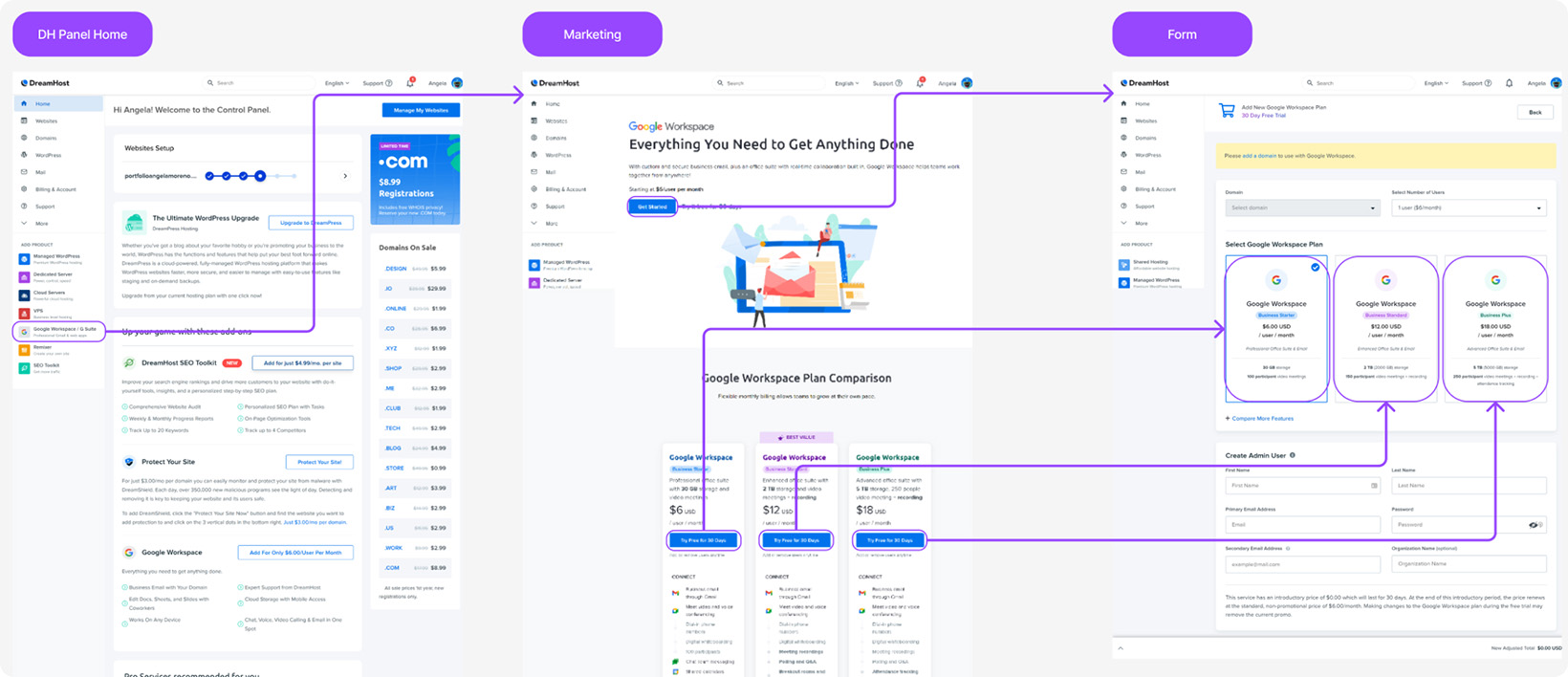
This user flow helped us map out every step the user takes to sign up for Google Workspace on the Panel.
The original sign-up process involved completing a one-page form, but after reviewing user behaviour during the sign-up process, we realized that several issues needed to be addressed.
One major problem was that the feedback provided to users was confusing and not specific enough, leaving them uncertain about what to do next when the form was incomplete or presented errors on the filled fields.
We also observed that mobile users encountered issues with the sign-up process due to a malfunctioning break-up point, which prevented them from being able to view the ‘Complete Sign Up’ button. As a result, they were forced to resort to clicking aimlessly around the page in effort to locate the button. This led to higher abandonment rates and decreased conversion rates.
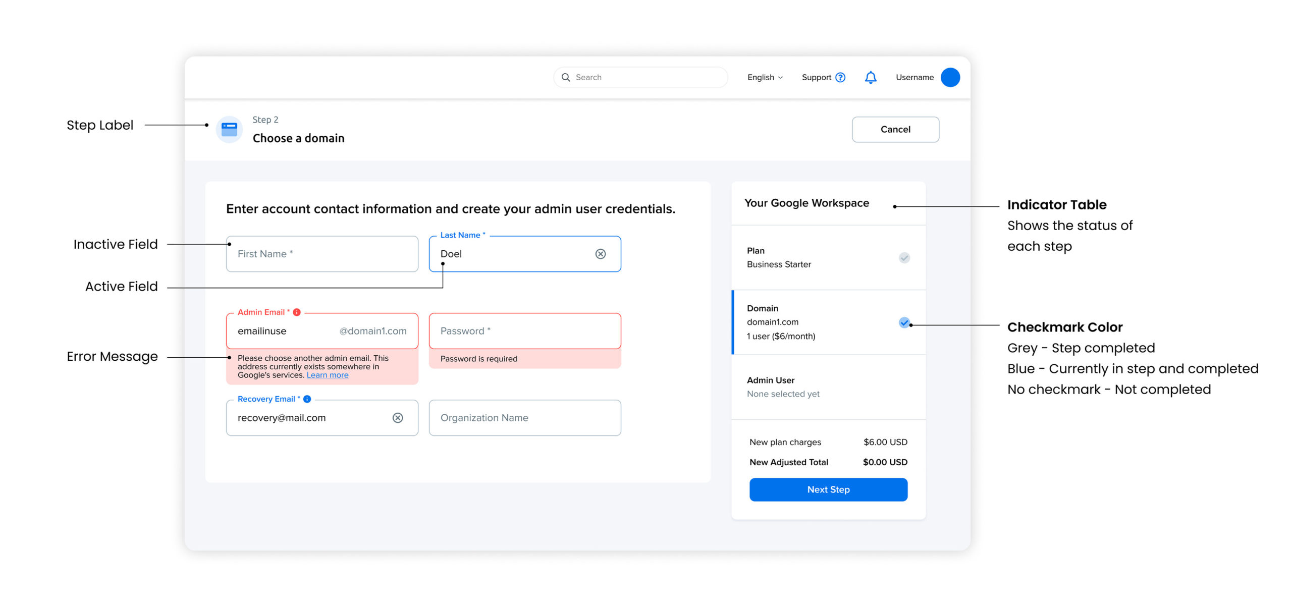
03 | The Solution
To address the problems with confusing feedback and unclear error messages, we came up with a solution: dividing the sign-up process into three distinct steps. This approach would allow the backend to check the user’s information at each step of the process, providing clear and specific feedback if an error is encountered. By breaking down the process into smaller, more manageable steps, we were able to create a more user-friendly experience that allowed users to easily navigate through the sign-up process without feeling overwhelmed or confused.
Overall, the decision to chunk the sign-up process into three steps was a key factor in the success of our redesign efforts, leading to a smoother, more efficient sign-up process that was more satisfying for users and provided valuable data for our team.
04 | Results
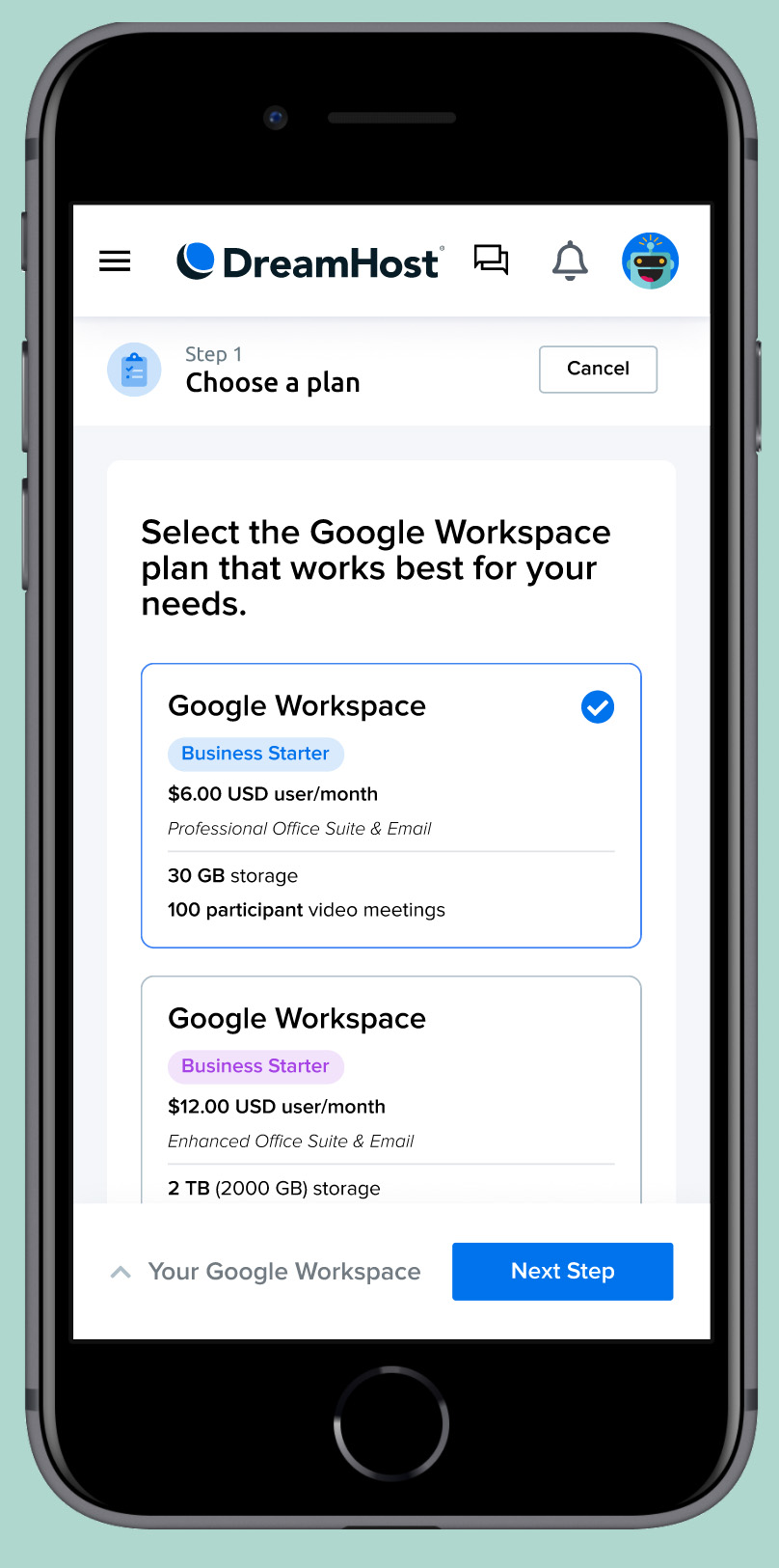
Using insights from user behavior research, we designed a clean, modern interface that breaks the process down into three simple steps.
The following prototype features clear and specific feedback at each stage, making it easy for users to complete the sign-up process without frustration. It’s also optimized for mobile, ensuring seamless sign-ups on any device. Overall, I believe my prototype will improve the user experience and streamline operations for both users and the backend team.
DELIVERABLES:
- Lo-fi Mockups
- Hi-fi Mockups: 12 screens
- Prototypes: Desktop and Mobile
- Languages: Spanish and English